Lucid Air HMI
HMI Design
Lucid Air HMI Details
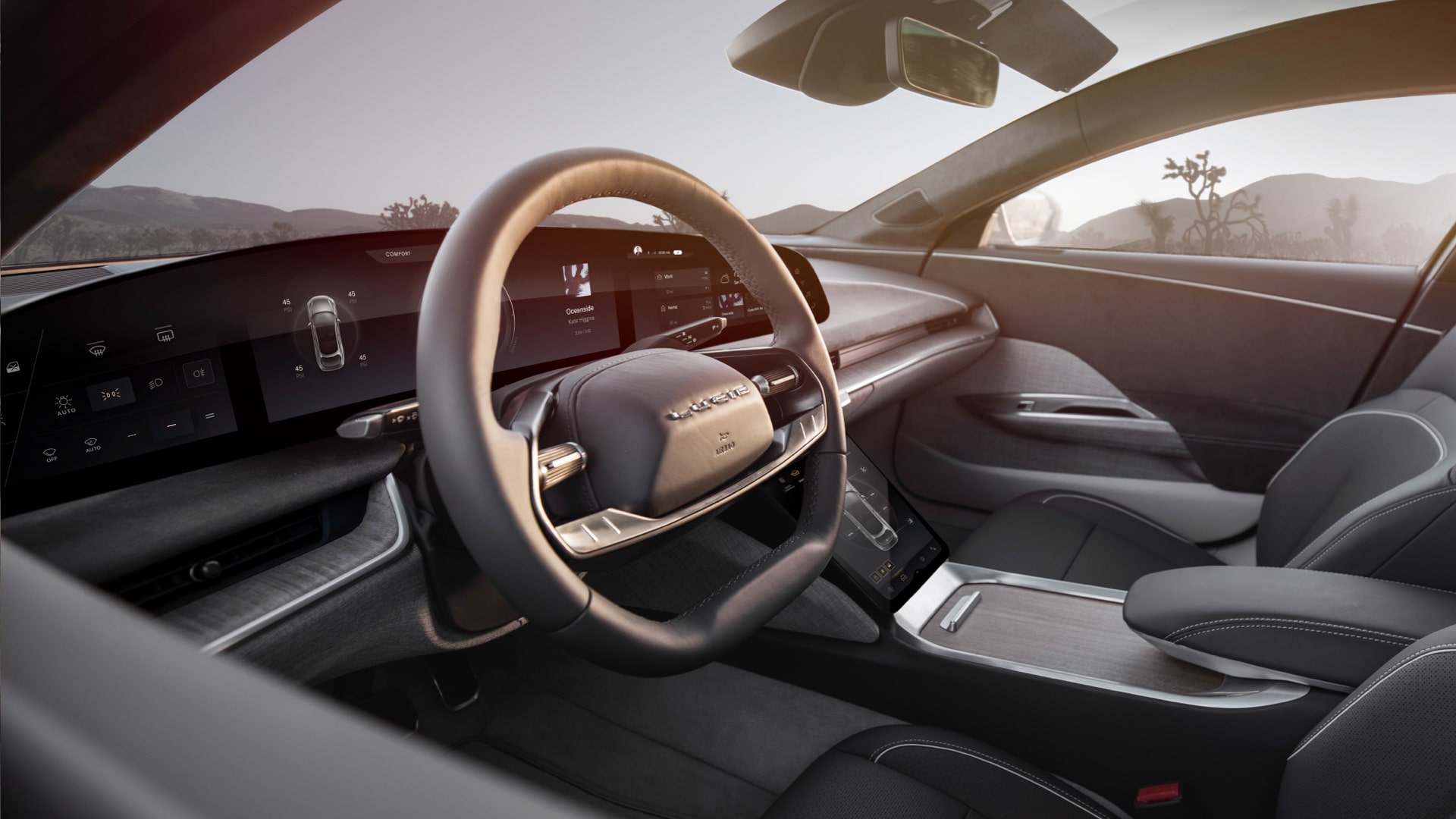
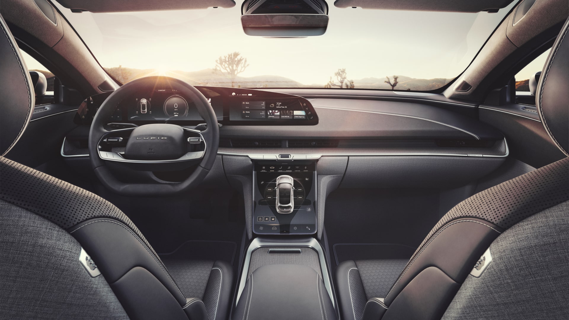
The Lucid Air interior was designed to ensure a seamless transition between the digital and physical space, with the UX and interior designers working closely to create one coherent design. Unrestricted by any legacy design, it takes the opportunity to define a modern style.
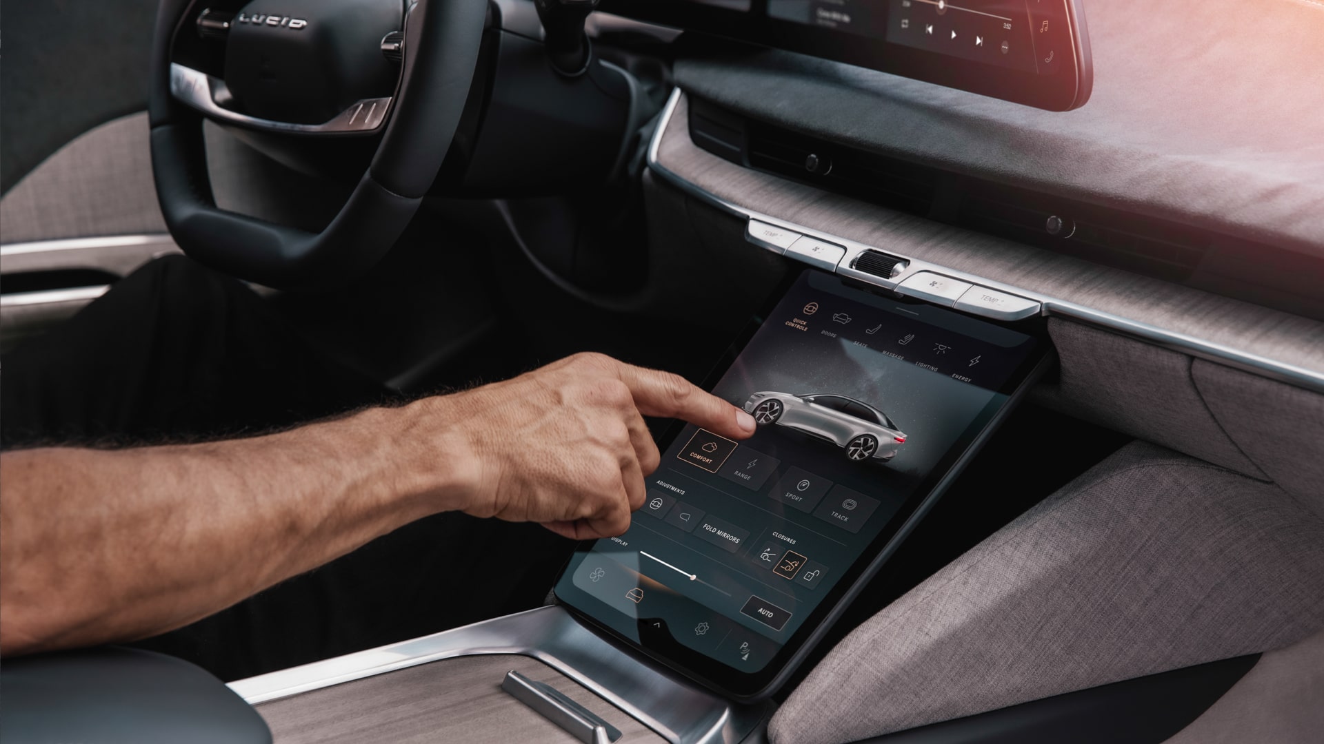
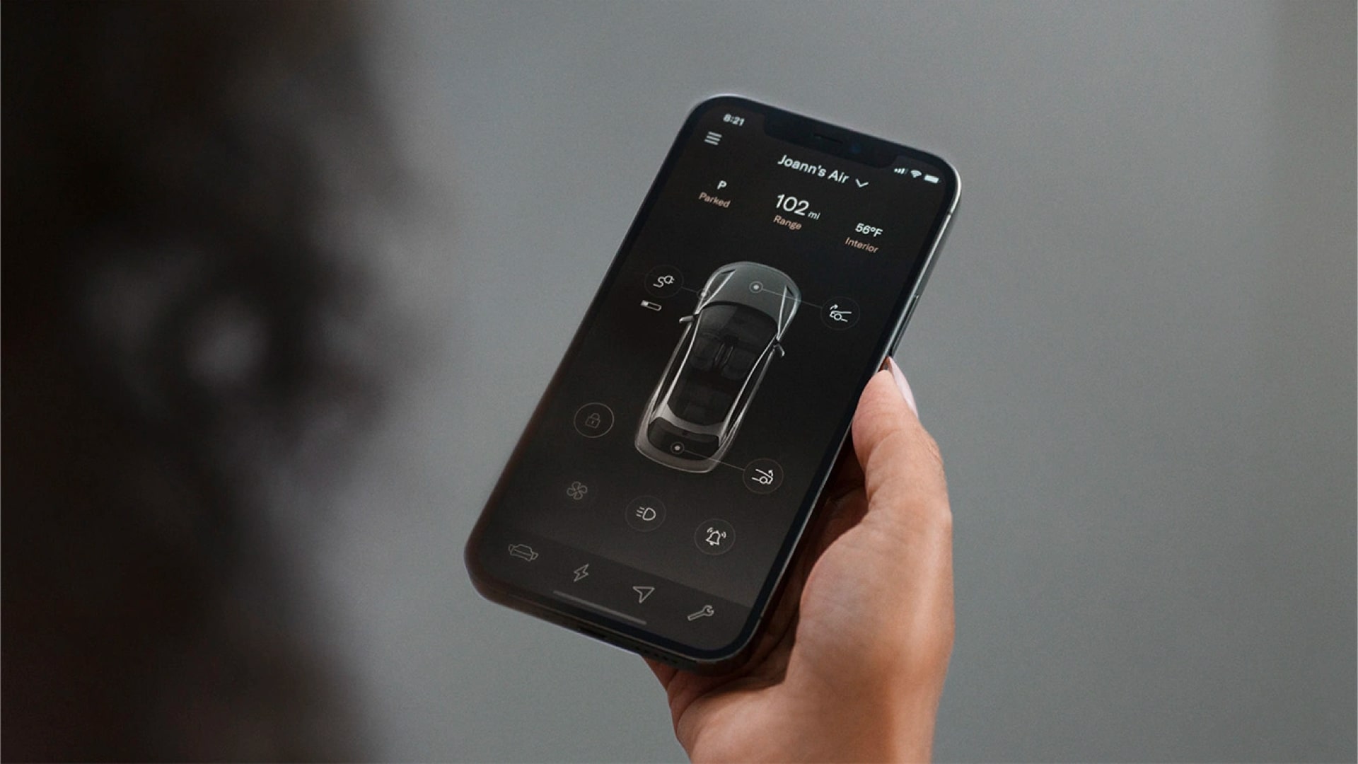
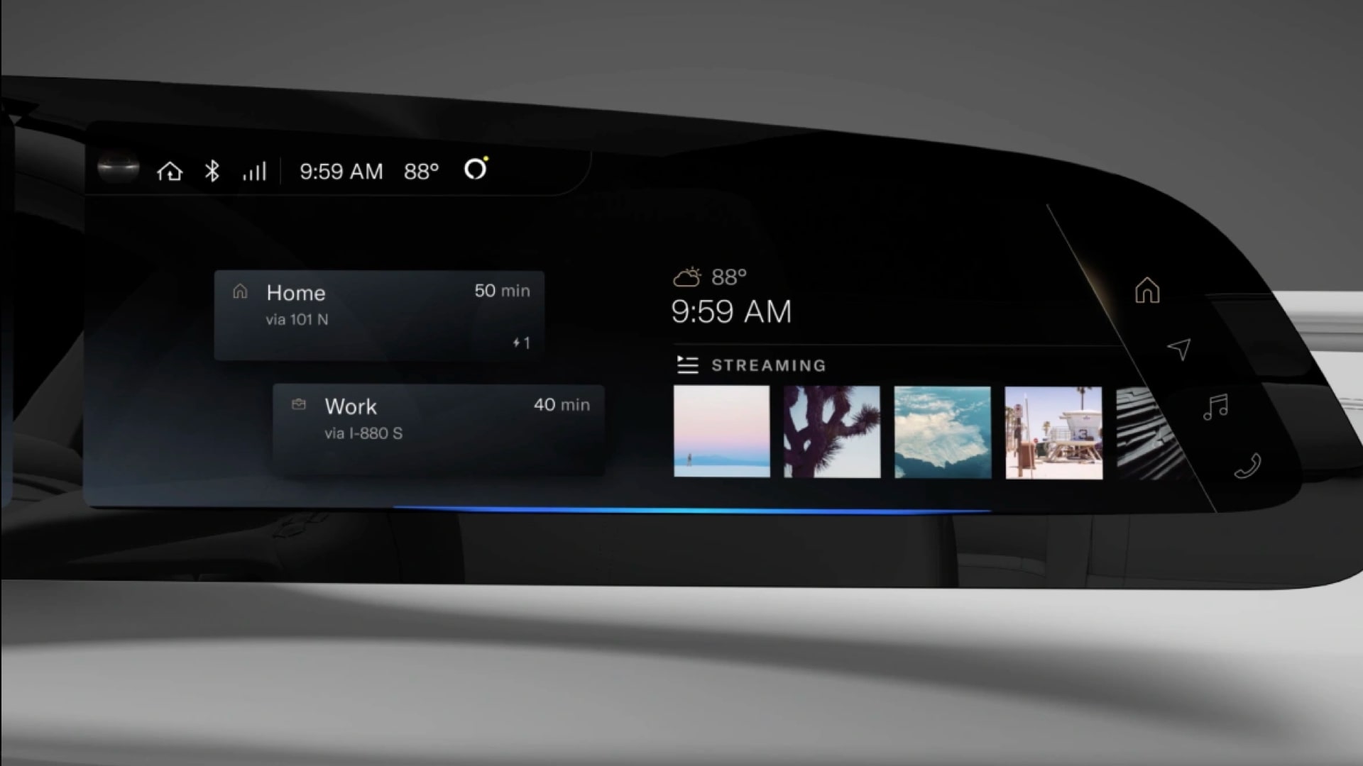
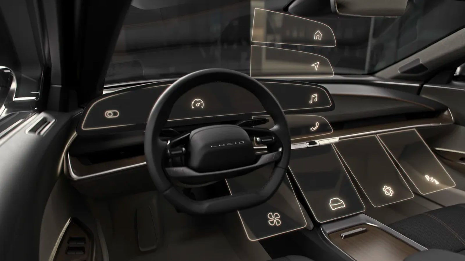
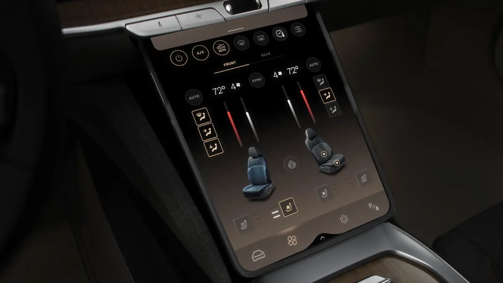
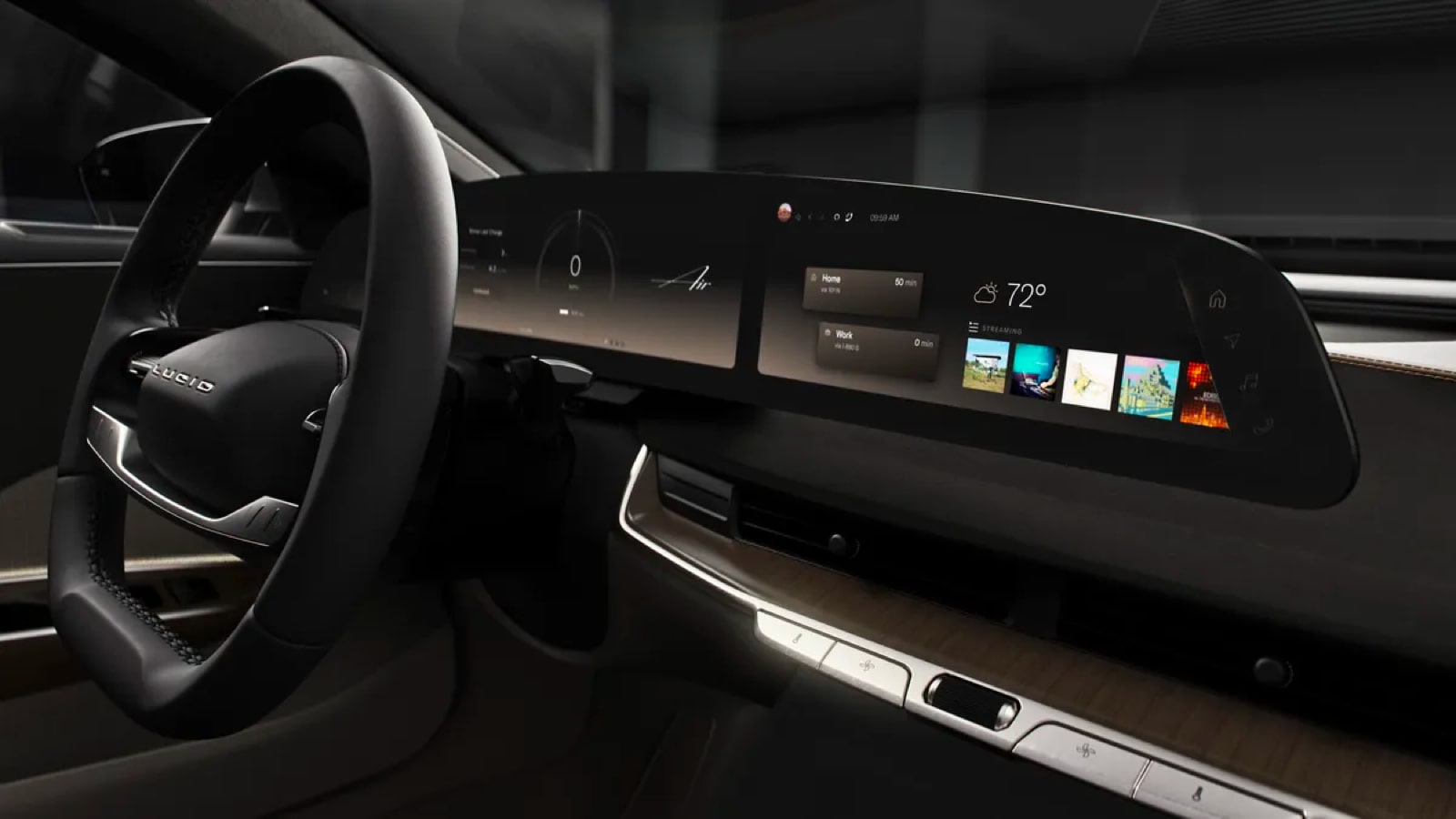
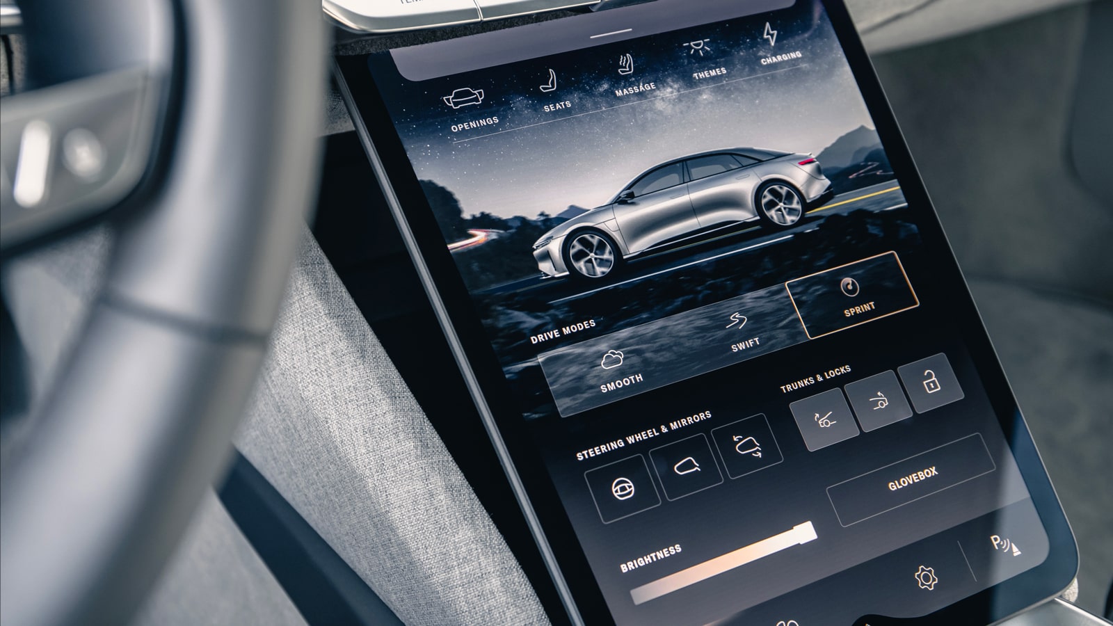
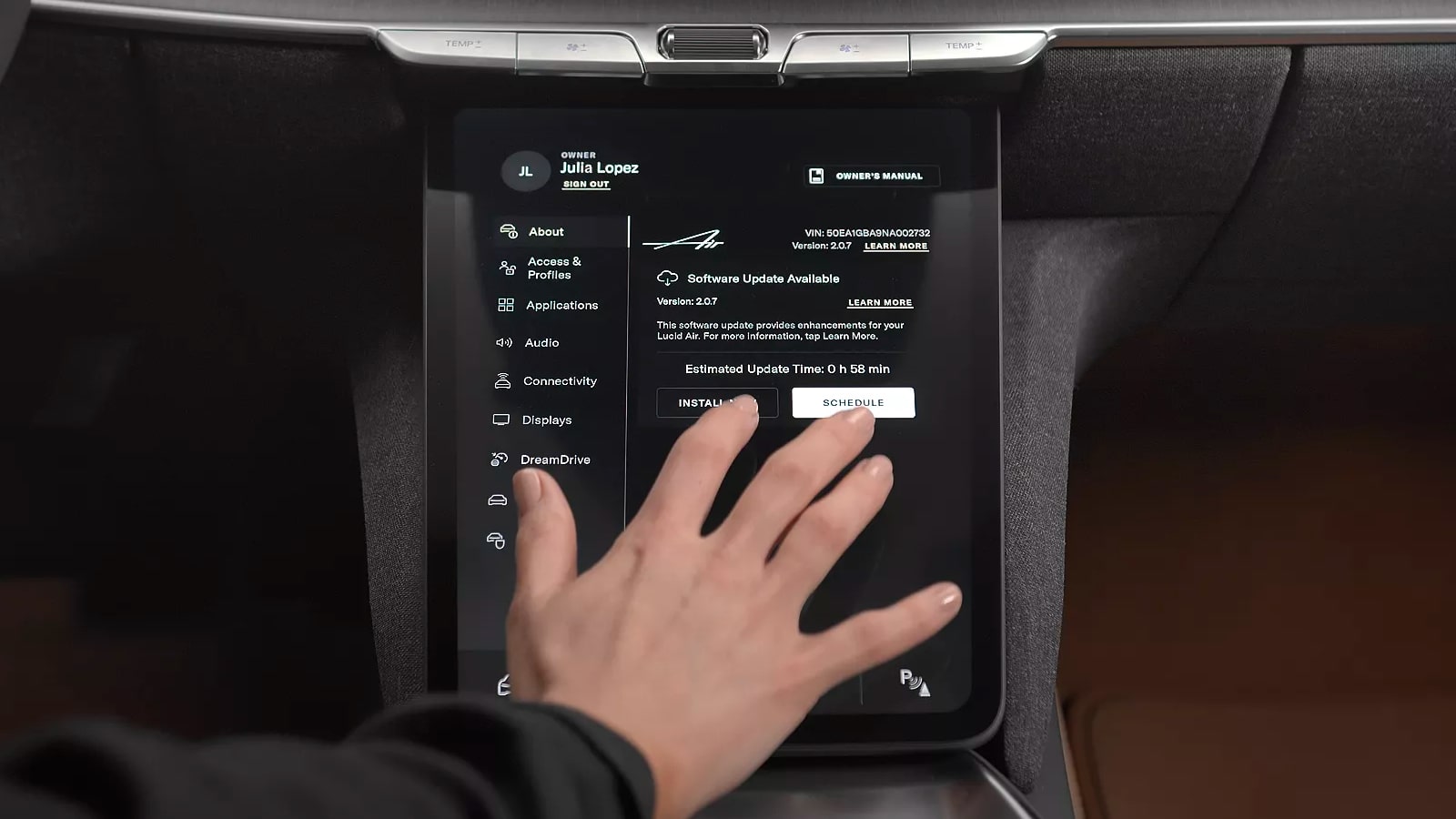
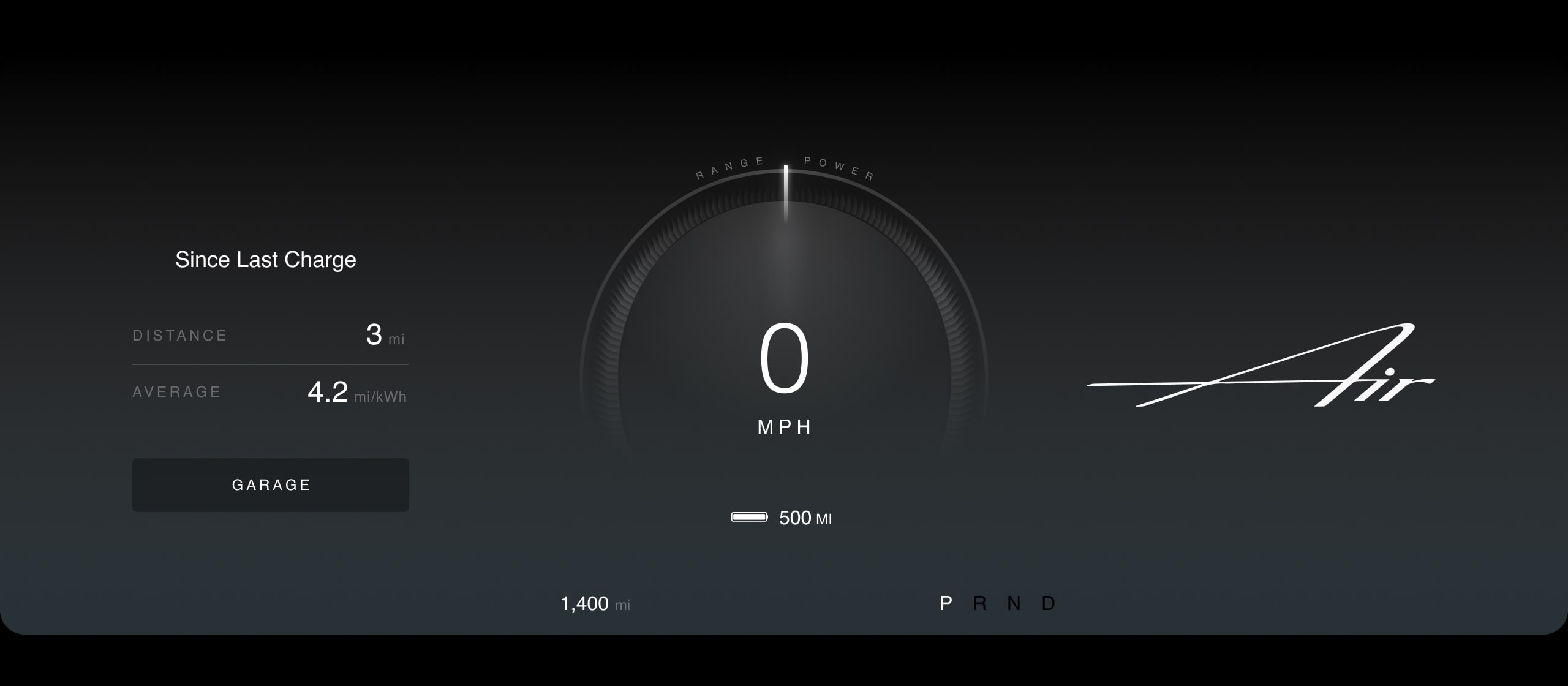
The design of the user interface uses a clear layering system, where the majority of the information lives in translucent tabs, cards and windows, separated by a lot of negative space. To support the minimal UI design, 3D models of the car are used to show information and access controls. The flat design of the interface is inspired by existing popular touch screen interfaces, using familiar UI elements such as icons, buttons and sliders positioned intuitively but with minimal decoration purely to communicate their function. To keep the interface up-to-date the Lucid receives over-the-air updates and enhancements through its secure and high-speed Ethernet-Ring data network.
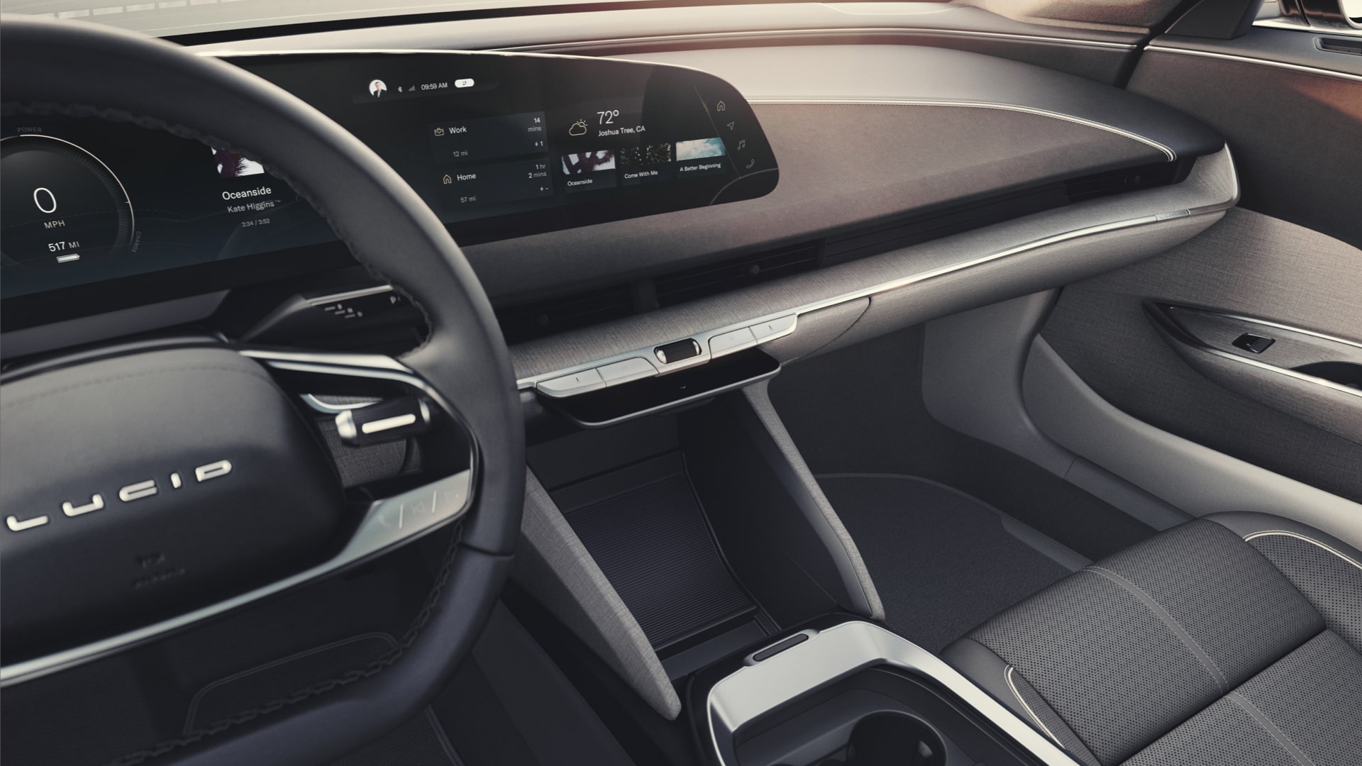
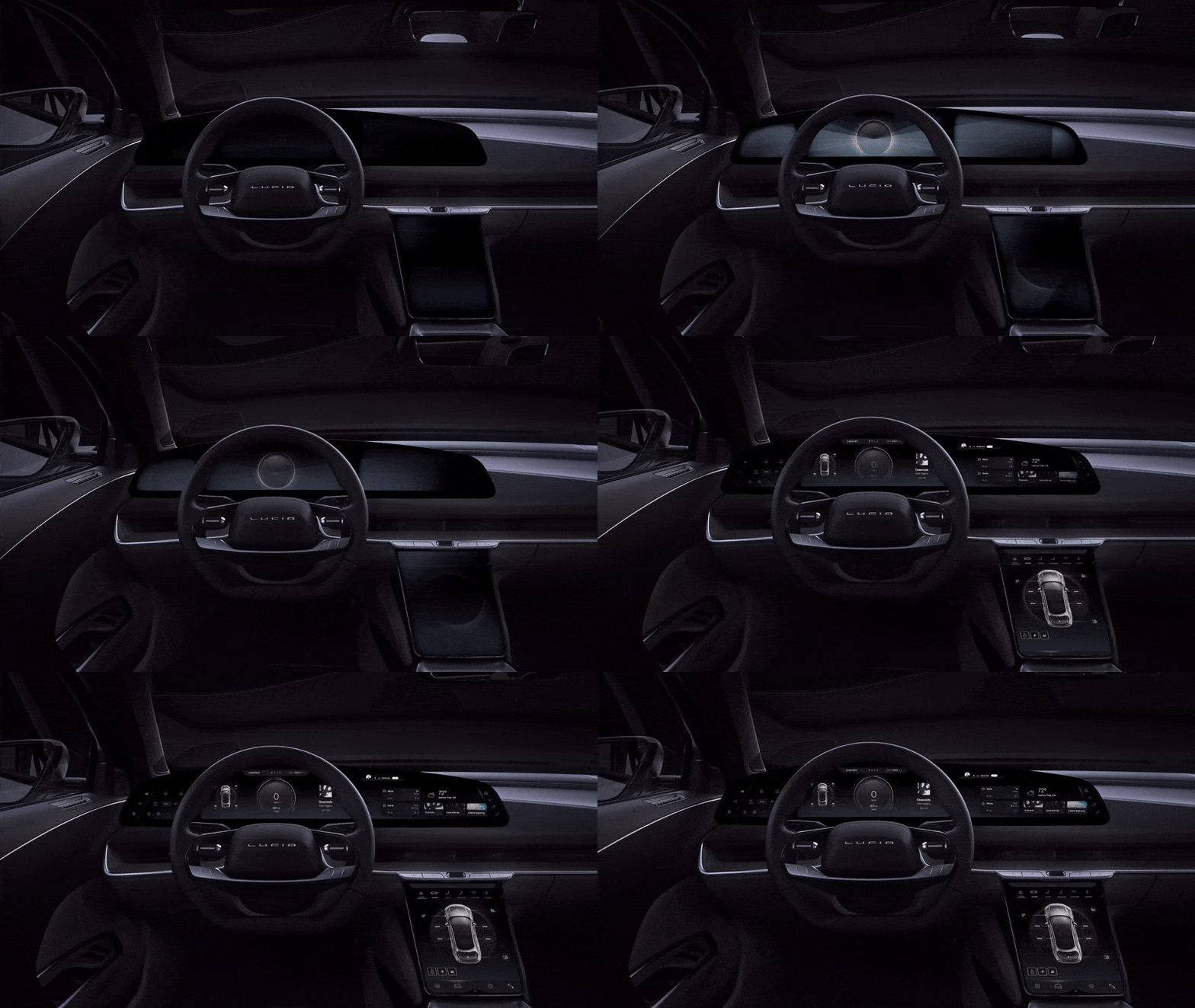
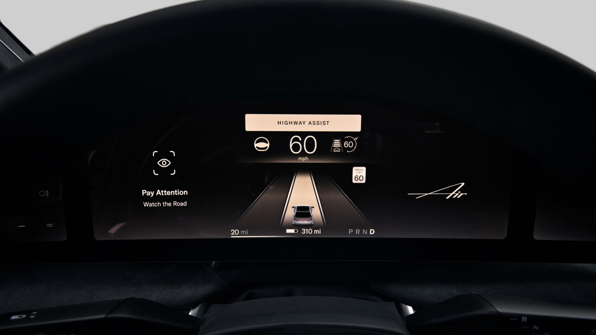
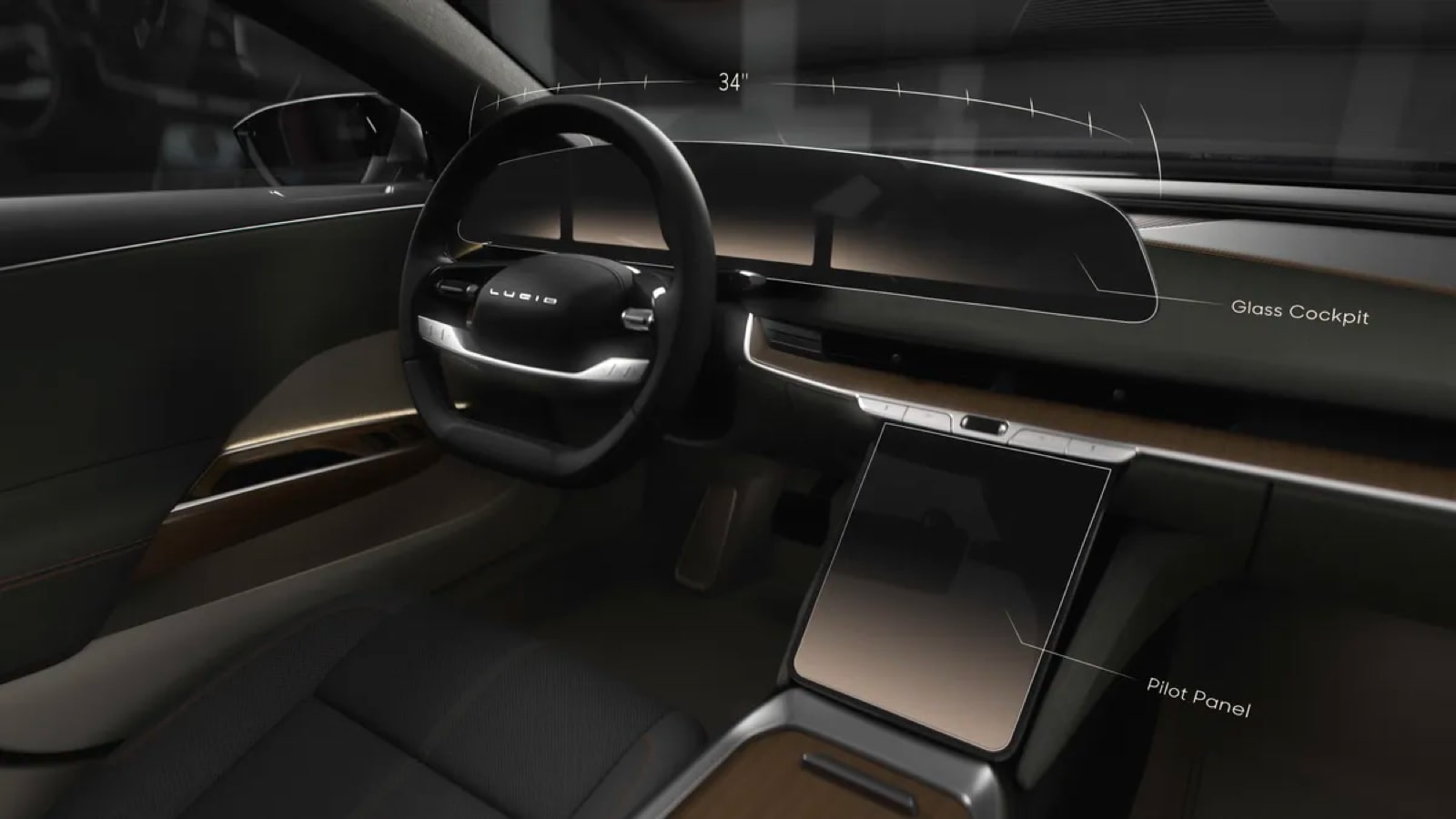
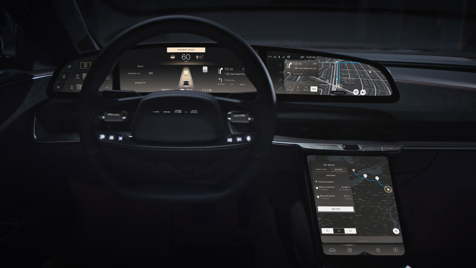
The Lucid Air’s main display is a floating 34-inch 5k glass cockpit panel, curved around the driver. Intuitively putting essential information in the drivers line of sight based on the driving style and conditions, with vehicle controls to the left, driving details in the center and navigation and media to the right. Additionally, a retractable central pilot panel allows for deeper control of features.
To support the touch screen interfaces the Lucid Air has Alexa built-in, giving the user deep integration of in-car controls simply by talking. Alexa can help the user adjust their seat heaters, lighting, sunshades, navigation, and more.
In addition to the seamlessly integrated technology the Lucid Air identifies features and interactions that are best served with physical controls. These include operations such as climate controls and window switches mounted on the dashboard, doors and steering wheel providing clear, tactile feedback.
HMI Gallery
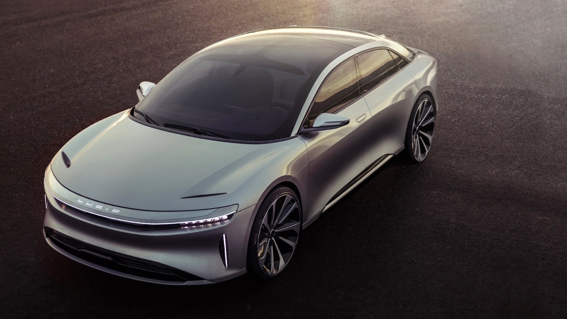
Image source: lucidmotors.com/media-room
Videos
Related Articles
More HMI Case Studies
Connect with us
HMI Gallery is a collection of case studies showcasing the features, functionality, fonts and iconography of digital interface design in high performance vehicles.
Curated by Ben Morris
Digital Creative
