Tesla Model S Plaid HMI
HMI Design
Tesla Model S Plaid HMI Details
With the release of Tesla’s new Model S Plaid, the HMI design team have come up with something special.
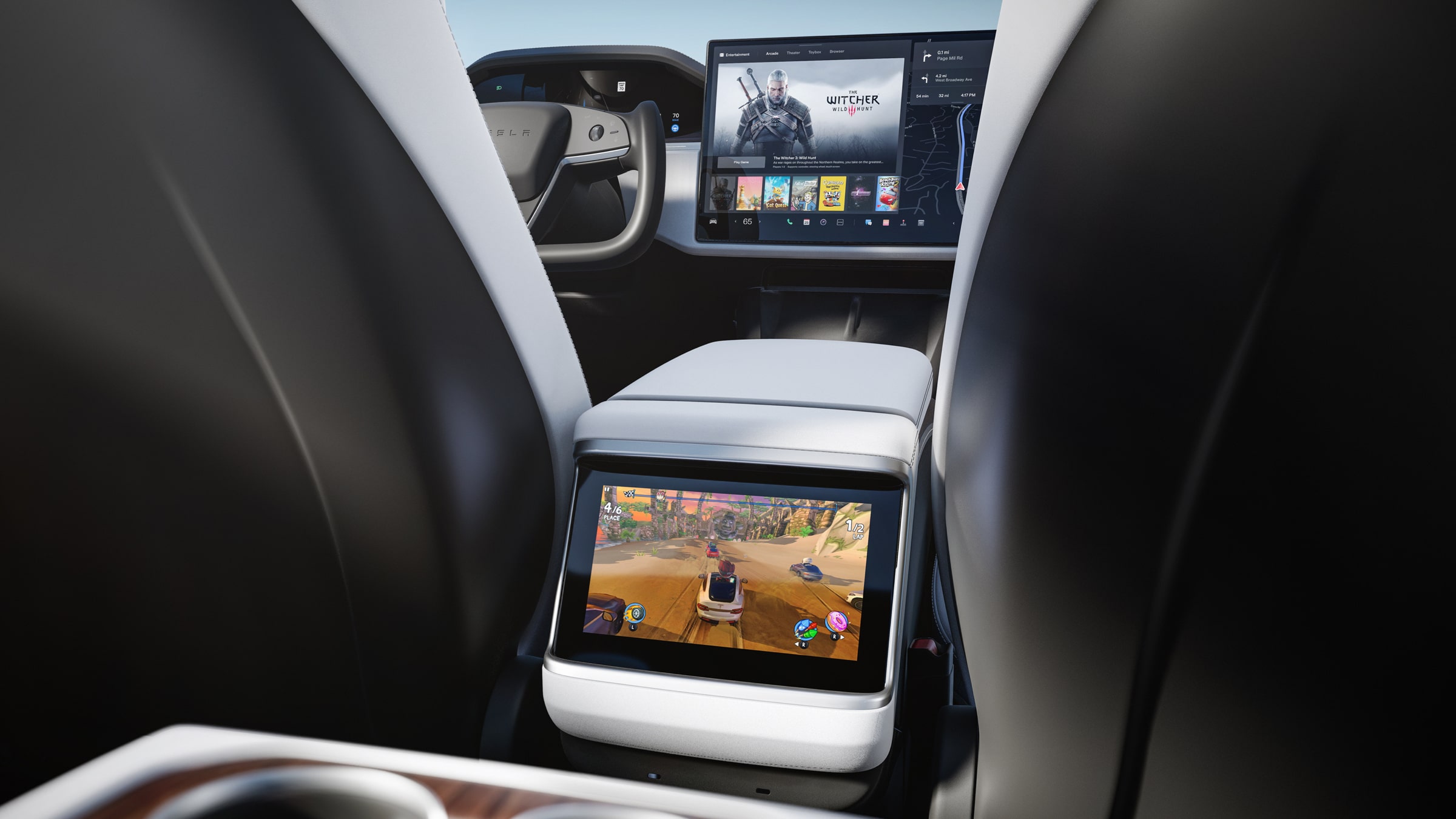
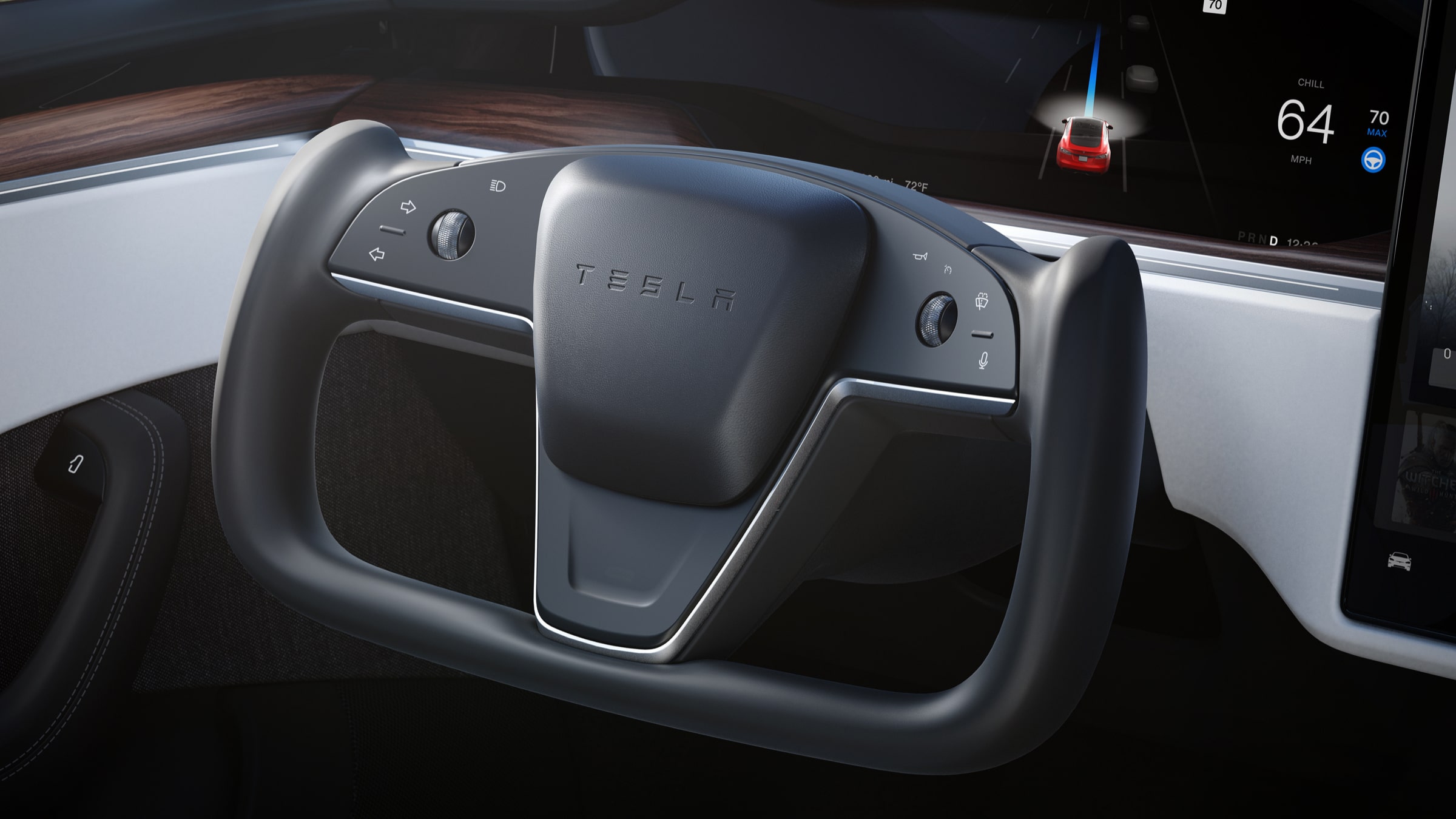
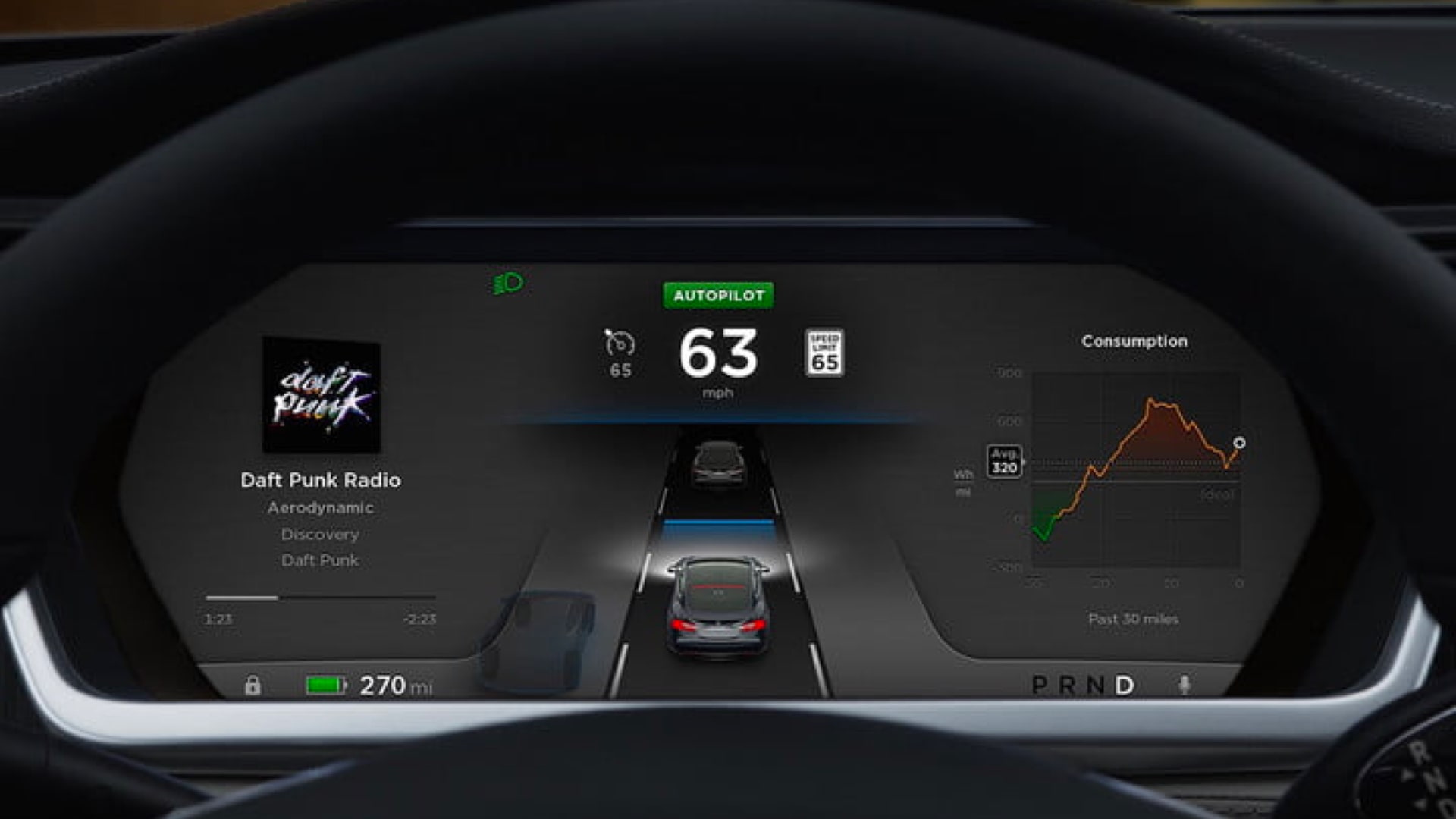
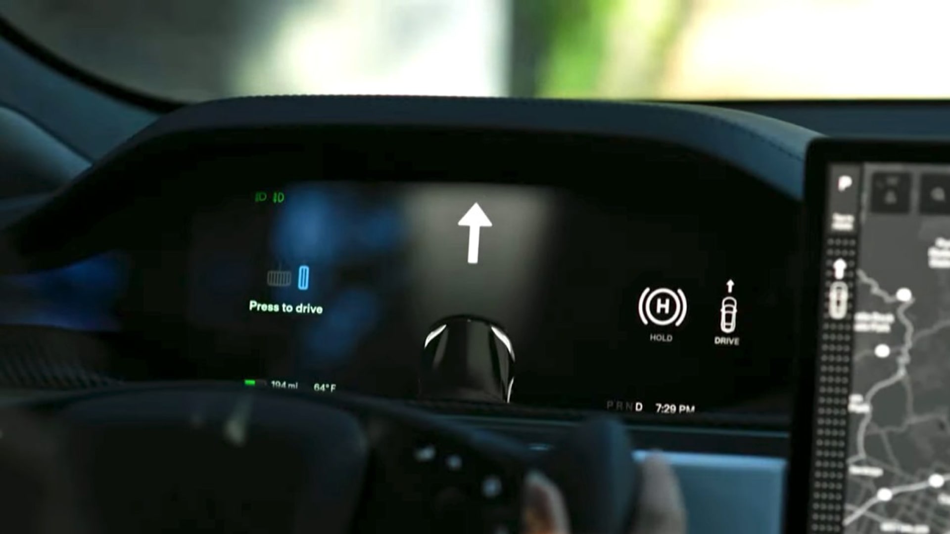
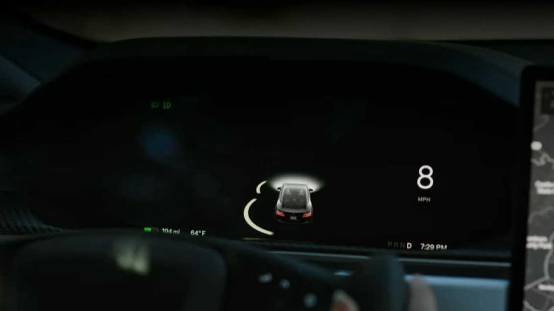
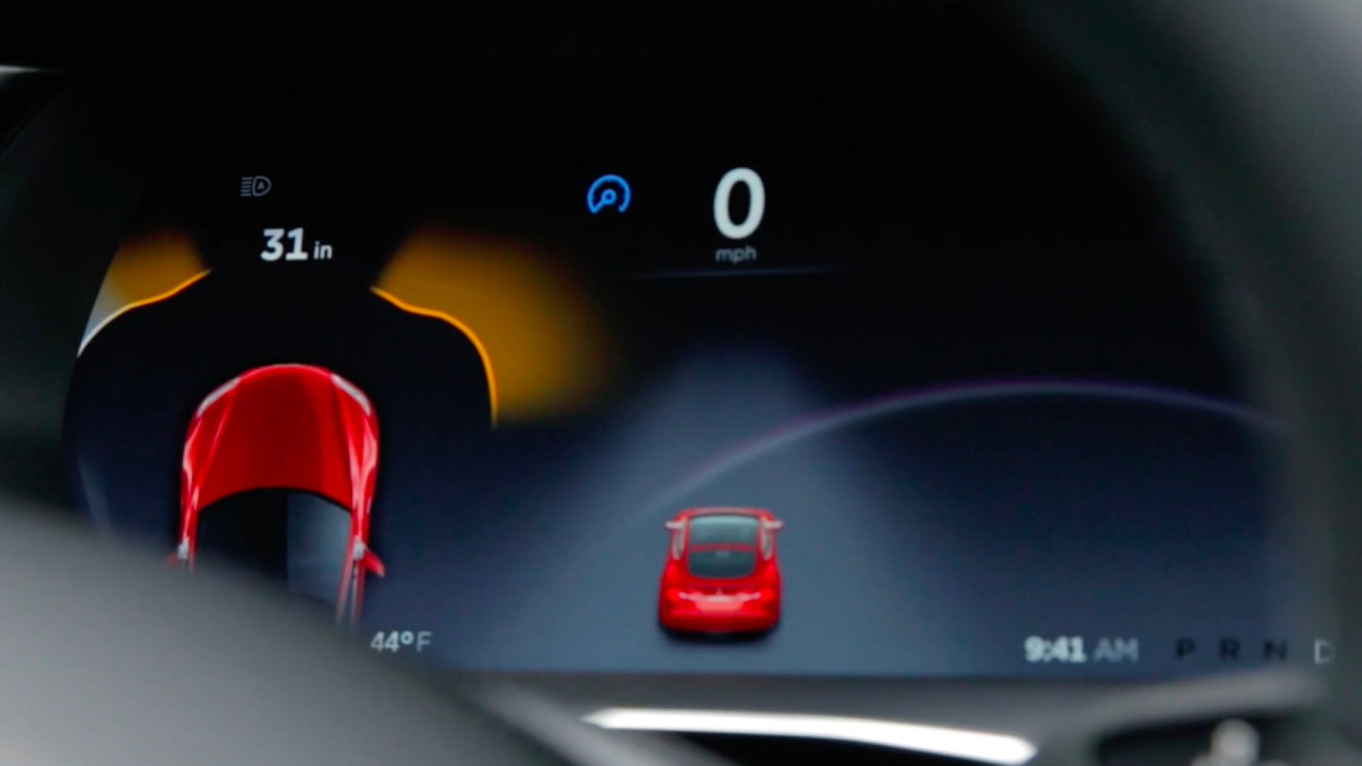
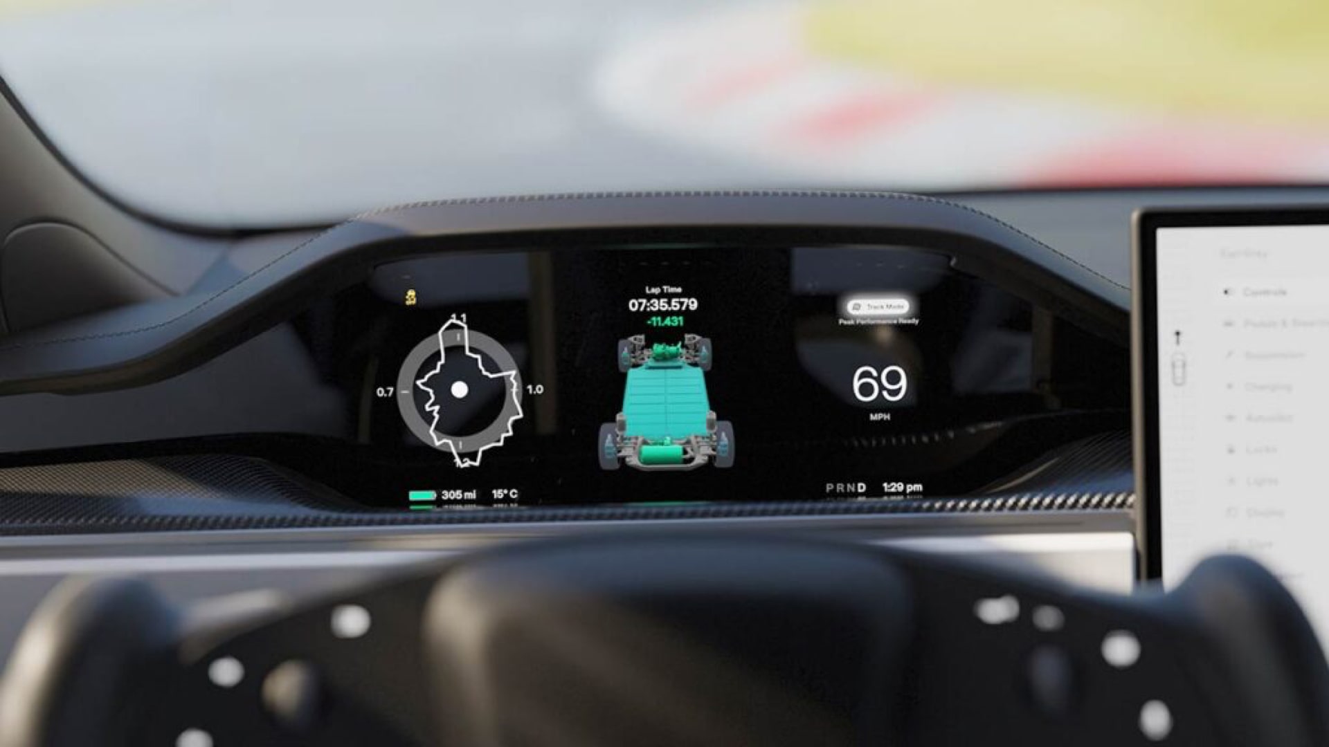
In the new Model S, Tesla has retained a separate screen for the instrument cluster, which is easily visible thanks to the yoke steering wheel. This separate screen also gives a lot more freedom to the UI of the main display as the driving visualisations for autopilot and the full self-driving package now take up a lot more space on the screen. The new UI features a completely redesigned controls window and app launcher as Tesla keeps introducing more features. By default, the user has the navigation app that covers the entire screen.
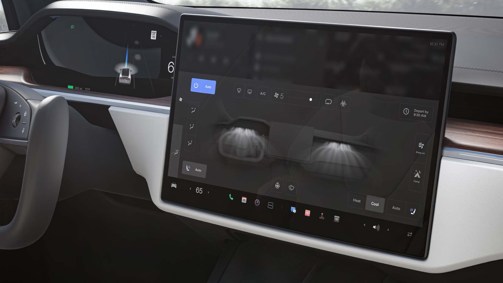
Users can now move other apps, like the music app, not only up and down but also left and right for more optimal access to the settings. The new control panel features large icons to access some of the most used features.
On the screen closest to the driver a dotted band runs the entire screen indicating Tesla’s new shifter, the user only has to swipe up or down to select the driving mode, however Tesla is hoping that drivers will rely more on its ‘auto shift’ feature that uses Autopilot to determine which driving mode (Drive, Reverse, or Park) the vehicle should be in.
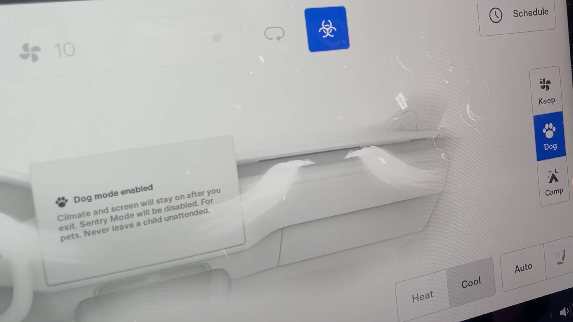
The new Model S also comes with Tesla’s new invisible A/C system integrated into the dash. These settings are accessible through the second-row screen, which also has access to all the entertainment features including the new PS5-level gaming computer.
With over-the-air software updates allowing regular improvements to the user interface, Tesla has now managed to build a significant lead when it comes to the HMI in cars.
HMI Gallery
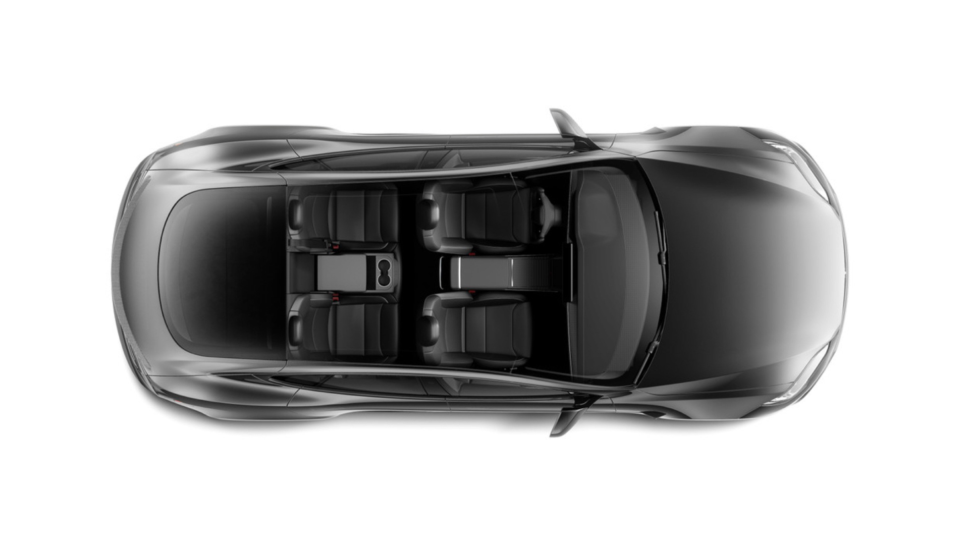
Image source: tesla.com/tesla-gallery
Videos
Related Articles
More HMI Case Studies
Connect with us
HMI Gallery is a collection of case studies showcasing the features, functionality, fonts and iconography of digital interface design in high performance vehicles.
Curated by Ben Morris
Digital Creative
